
When doing a personal colour analysis, one of the key steps is finding each client’s signature colours. These are the colours from a base palette, and then selecting the very best colours from within that base palette which harmonise with hair, eyes, skin, lips, etc.
I am a colour specialist trained in the Absolute Colour System (ACS), and there are 18 palettes to choose from within this system (I’m not talking about the seasonal colour system that most people are familiar with – A seasonal colour system lacks a few crucial components of analysis and is limited in terms of its palettes. The colour system should provide options; rather than locking you into a palette that does not feel right, it should be a system that allows you to select the one that best suits you). However, even with this signature selection of colours, you still need to figure out how to wear your signatures in a way that harmonises with your colouring. Each colour palette in the ACS system is made up of colours with similar properties, ensuring that they complement one another.
- Your ideal value relates to the value of your hair.
- Value Contrast – the difference between the lightest and darkest parts of your colouring.
- Colour Contrast – the difference and relationship between the colours in your colouring.
You can get your colour analysis done with me to find your ideal colour palette. Once you’ve identified your ideal colour palette, you can start to put flattering outfits together. The right colours will create a harmonious balance between what you wear and you.
You appear healthy, rested and more youthful. Simply, the colours you’re wearing aren’t washing you out, making you look tired or older. Simple example: given how expensive hair colouring is and how much of a difference a good hair colour makes compared to a bad one, it should be the most flattering hair colour that flatters your complexion.
The right colours will make you look taller and slimmer, as they create a face focus, not a body focus.
A photograph of Victoria Beckham – notice how the cool green blends in better while the warm green stands out – catches your eye even before you see her (although full make-up and numerous filters were used in these photographs, as colour analysis must be performed under different conditions).
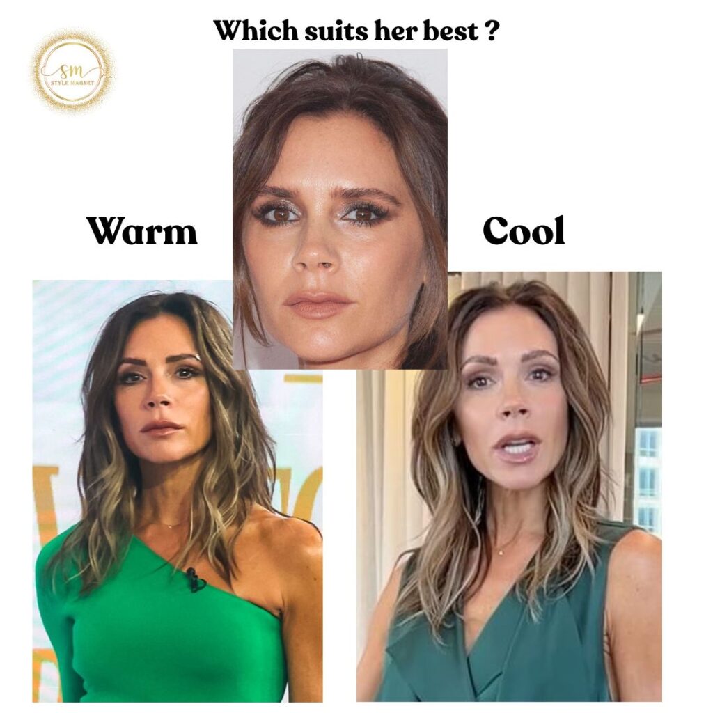
The most important thing to remember about colours is that they should be in harmony with you. They should look like you rather than taking attention away from you. They should enhance your complexion rather than dull it or overwhelm it.
Warmest,
Rahşan